A Chapter Logo
#91
 04-11-2007, 06:57 PM

Join Date: Jan 2007
Location: Sequim, WA
Posts: 4,287
Likes: 0
Received 0 Likes
on
0 Posts
Originally Posted by webmaster
From a practical standpoint and one of experience I strongly recommend you folks reconsider this design. Its going to be very difficult and more expensive to reproduce on t-shirts, business cards and other items. Simple, uncomplicated drawing based designs work best for reproduction across a variety of mediums, embossed metalic things like this...don't.
Rex, PM me if you wouldn't mind researching the costs.
Do we need to start a poll for acceptance of Brents Logo as the chapter Logo? PM me.
#92
04-11-2007, 07:26 PM
Elder User
Join Date: May 2006
Location: Spokane, Washington
Posts: 947
Likes: 0
Received 0 Likes
on
0 Posts
#93
04-12-2007, 01:28 PM
Originally Posted by Placermike
Looks like Ken has already taken a look. I think if we like, go for it...I have never minded a little expense for better quality. If we want to get business cards, magnets, notepads and such, Vista Print has great prices on photo quality items. There is also great software to modify an images so it appears as though pen drawn etc.
Rex, PM me if you wouldn't mind researching the costs.
Do we need to start a poll for acceptance of Brents Logo as the chapter Logo? PM me.
Rex, PM me if you wouldn't mind researching the costs.
Do we need to start a poll for acceptance of Brents Logo as the chapter Logo? PM me.
A couple of good supplier tips have come in already -- Mike you're Vista Print for things other than ballcaps and Tshirts, and Marty suggested Cafe Press for Ballcaps, Tshirts & mugs. Cafe Press will make single orders, two or three, or bulk orders over 15 items at up to 35% discount. Will ship individually to each of us, or bulk to one person.
So as soon as we know if our Logo is approved and will show up on a Tshirt or a simple version to stitch into a ballcap, we can place an order. It has to be non-copyright approved, or why take a vote on it yet.
#94
04-12-2007, 01:36 PM
Originally Posted by brentleedragon
well guys if it becomes accepted or even if not I will go and get some paper to be able to print it and iron it on a shirt and see how it works if you guys want me to
Brent, it has to pass the copyright test or most commercial Printers won't touch it. We could burn our own, but my experience is that the color-transfer doesn't last more than a few washings.
So after it's approved for copyrights, an iron on color transfer test would be good so we can see if going to a commercial printer is viable. Theirs will be a little better quality transfer, but the complexity and colors of the logo might make any affordable printing a no-go...
#95
04-12-2007, 03:27 PM
Actually the reason I didn't respond is I think my supplier would spew coffee through his nose if he saw the design. I don't mean that in any sort of insulting way,  just that how well its going look will be obvious to someone like him (and me, I used to work in the t-shirt industry way back in my younger days). Its great for a belt buckle, not great for print. Yeah, you can do it with Cafepress but you won't like the results after a few washes where the texture is going fade into a grey fuzz. Will someone be able to tell what it is from 10 or 20 feet away? Shrink it down for a business card and the texture is going to be hard to see.
The design won't work with a ball cap due to the limited number of thread colors you have to go with. Even FTE's logo is tough in some cases for caps because it uses gradients.
Go with the design if you want to, just don't be surprised if people don't know what it is on your shirt until they get close.
just that how well its going look will be obvious to someone like him (and me, I used to work in the t-shirt industry way back in my younger days). Its great for a belt buckle, not great for print. Yeah, you can do it with Cafepress but you won't like the results after a few washes where the texture is going fade into a grey fuzz. Will someone be able to tell what it is from 10 or 20 feet away? Shrink it down for a business card and the texture is going to be hard to see. The design won't work with a ball cap due to the limited number of thread colors you have to go with. Even FTE's logo is tough in some cases for caps because it uses gradients.
Go with the design if you want to, just don't be surprised if people don't know what it is on your shirt until they get close.
Last edited by FTE Ken; 04-12-2007 at 03:31 PM.
#96
04-12-2007, 10:16 PM
I understand; we had the same Tshirt & ballcap problems with a six-colored Owl foreground with a mountainous forested background and lake, with a hawseline border and lettering. The Tshirts & ballcaps were expensive and soon illegible; the only legible design was on paper, coffee mug, and a monitor.
Brentlee, your latest excellent colored design is good for hard surfaces like coffee mugs, paper, monitors, big buckles, and __ . (Is the word Ford going to make it into the flag-background oval?)
For Tshirts and ballcaps, can a "dumbed-down" simpler logo with fewer lines and more color contrast be designed?
#97
04-12-2007, 11:17 PM
Elder User
Join Date: May 2006
Location: Spokane, Washington
Posts: 947
Likes: 0
Received 0 Likes
on
0 Posts
my sister is still trying to help me because of the BUILT TOUGH she thinks it might be a problem....but I will know for sure tomorrow.
on a "dumbed-down" version i am not too sure what you mean? like a less quality when saving the file? so that it isn't as defined? i can put a light blur one everything to see if it will make the lines flow down but im not sure...like what has been said now that I see it more often it seems as on a t-shirt it might be hard....i'll work on it for a t-shirt design and see if I can come up with anything
on a "dumbed-down" version i am not too sure what you mean? like a less quality when saving the file? so that it isn't as defined? i can put a light blur one everything to see if it will make the lines flow down but im not sure...like what has been said now that I see it more often it seems as on a t-shirt it might be hard....i'll work on it for a t-shirt design and see if I can come up with anything
#98
04-12-2007, 11:32 PM
Ack! Not blurry. Sori i didn't say it right. The problem with many colors and intricate designs on fabric is that they bleed into each other, more colors cost more to print or stitch, and complex "busy" designs on fabric are hard to read more than a few feet away.
So for fabric, the sharper is the better. Fewer curves and lines. And the most contrast possible, meaning a maximum of three colors that are far apart in the color spectrum, plus the normal background color of the Tshirt.
Like Red and Blue on a White Tshirt (Or a lightlight pale gray Tshirt for us dirties).
#99
04-12-2007, 11:36 PM
Posting Guru
Join Date: Feb 2007
Location: Graham, WA
Posts: 1,326
Likes: 0
Received 0 Likes
on
0 Posts

#100
04-12-2007, 11:40 PM
Elder User
Join Date: May 2006
Location: Spokane, Washington
Posts: 947
Likes: 0
Received 0 Likes
on
0 Posts
Originally Posted by RexB
Ack! Not blurry. Sori i didn't say it right. The problem with many colors and intricate designs on fabric is that they bleed into each other, more colors cost more to print or stitch, and complex "busy" designs on fabric are hard to read more than a few feet away.
So for fabric, the sharper is the better. Fewer curves and lines. And the most contrast possible, meaning a maximum of three colors that are far apart in the color spectrum, plus the normal background color of the Tshirt.
Like Red and Blue on a White Tshirt (Or a lightlight pale gray Tshirt for us dirties).
So for fabric, the sharper is the better. Fewer curves and lines. And the most contrast possible, meaning a maximum of three colors that are far apart in the color spectrum, plus the normal background color of the Tshirt.
Like Red and Blue on a White Tshirt (Or a lightlight pale gray Tshirt for us dirties).
so three colors eh? mhmm that might be a bit difficult as in the picture wont look all that good but it might on the shirt let me work with it
#101
04-23-2007, 01:38 PM
Elder User
Join Date: May 2006
Location: Spokane, Washington
Posts: 947
Likes: 0
Received 0 Likes
on
0 Posts
i hvnt been on at all lately so here is some stuff i showed mike
http://i6.photobucket.com/albums/y24.../edit3copy.jpg
http://i6.photobucket.com/albums/y24.../edit2copy.jpg
http://i6.photobucket.com/albums/y24.../edit1copy.jpg
they will have transparent backgrounds
http://i6.photobucket.com/albums/y24.../edit3copy.jpg
http://i6.photobucket.com/albums/y24.../edit2copy.jpg
http://i6.photobucket.com/albums/y24.../edit1copy.jpg
they will have transparent backgrounds
#102
04-23-2007, 09:55 PM
Join Date: Jan 2007
Location: Sequim, WA
Posts: 4,287
Likes: 0
Received 0 Likes
on
0 Posts
#103
04-24-2007, 09:16 AM
3 colors plus the white background of the Tshirt.
White doesn't count because wherever white is, the printers' template is blank to allow the white Tshirt to show through (if they haven't changed methods since I bought things).
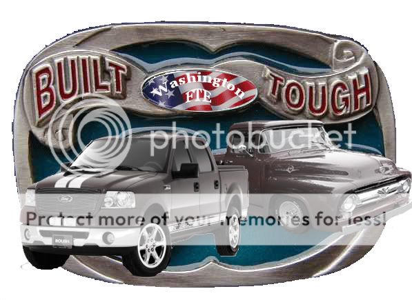
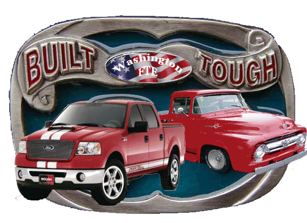
I know you're getting tired of designing these Brent but those three designs won't be distinguishable on any fabric or stitching because it's mostly different shades of gray.
Your previous design below is closest to the one that will show up best on fabric, and is my favorite for a monitor display.
For fabric and stitching:
-Delete the entire circular gunmetal-gray band around the whole thing.
-Delete/white-out the gunmetal-gray background band behind "Built Washington FTE Tough".
-Delete the grayish-bluish background behind the trucks. All of that will become white.
-Because it has to have blue for the Stars and Stripes, change the old Ford truck to the same blue.
-Change the new truck color to a bright red like the old truck was. The words "Built Tough" the same red color as the new truck.
-Add "Ford" & "Trucks" above and below the design in the same bold blue as the old truck, since I guess the word Ford in any oval-style emblem is a problem (?)
That leaves three prime colors plus the white background (white doesn't count as a printing color.)
So it will end up as a bright red and blue trucks with a "Built Washington Ford FTE Tough" over it.
FORD
TRUCKS
Lol Brent, i hope that made sense cuz it wore me out just describing it, let alone trying to do it to the image.
White doesn't count because wherever white is, the printers' template is blank to allow the white Tshirt to show through (if they haven't changed methods since I bought things).
I know you're getting tired of designing these Brent but those three designs won't be distinguishable on any fabric or stitching because it's mostly different shades of gray.
Your previous design below is closest to the one that will show up best on fabric, and is my favorite for a monitor display.
For fabric and stitching:
-Delete the entire circular gunmetal-gray band around the whole thing.
-Delete/white-out the gunmetal-gray background band behind "Built Washington FTE Tough".
-Delete the grayish-bluish background behind the trucks. All of that will become white.
-Because it has to have blue for the Stars and Stripes, change the old Ford truck to the same blue.
-Change the new truck color to a bright red like the old truck was. The words "Built Tough" the same red color as the new truck.
-Add "Ford" & "Trucks" above and below the design in the same bold blue as the old truck, since I guess the word Ford in any oval-style emblem is a problem (?)
That leaves three prime colors plus the white background (white doesn't count as a printing color.)
So it will end up as a bright red and blue trucks with a "Built Washington Ford FTE Tough" over it.
TRUCKS
Lol Brent, i hope that made sense cuz it wore me out just describing it, let alone trying to do it to the image.
Last edited by RexB; 04-24-2007 at 09:30 AM.
#104
04-25-2007, 09:46 PM

I think if we use the add-on trucks, then the background should be different. The enamel around the old trucks shows up, and they just look laid on top of the background, not like they are supposed to be there. If we are going to use the trucks, then we should do a different background. The general design of the belt buckle is nice, but needs to be 2d as Ken stated before.

Thread
Thread Starter
Forum
Replies
Last Post