


Chapter stickers
Lead Driver
Joined: Jul 2007
Posts: 5,715
Likes: 1
jpeg is really crappy for pictures, it F's everything up on the edges even at 100% quality exports. unfortunately its the only "universally" excepted pic format for loading onto websites.
looks good pete.
i thought it looked good when i made it but im agreeing with you guys now...the stencil text is kinda hard. i think i like the "CT" versus "Connecticut".......it allows for a larger font size to be used and still fit it into the ct outline.
any other requests / ideas?
looks good pete.
i thought it looked good when i made it but im agreeing with you guys now...the stencil text is kinda hard. i think i like the "CT" versus "Connecticut".......it allows for a larger font size to be used and still fit it into the ct outline.
any other requests / ideas?
Thread Starter
|
Post Fiend
Joined: Dec 2008
Posts: 7,649
Likes: 2
From: Wallingford, CT
Yea. I figure CT allows for a larger font size and faster reading which is key in a window sticker.
The larger and shorter it is the easier it is to read and that is key with a window sticker.
Sorry if that's hard to understand. I'm dogsitting for 3 dogs. 1 is a puppy who is less than 1 that is being a total jackhole at the moment.
The larger and shorter it is the easier it is to read and that is key with a window sticker.
Sorry if that's hard to understand. I'm dogsitting for 3 dogs. 1 is a puppy who is less than 1 that is being a total jackhole at the moment.
Lead Driver
Joined: Jul 2007
Posts: 5,715
Likes: 1
ok, this is very rough but im just not a good enough artist to swing it freehand. basically i stole the idea from the CT emmissions testing logo. obviously we can do anything with the text but the overall look is the text breaking out of a half outline of the state. just another idea........

Thread Starter
|
Post Fiend
Joined: Dec 2008
Posts: 7,649
Likes: 2
From: Wallingford, CT
I think we've had plenty of time to think up ideas and we need to vote on one to present for approval.
FTE Stories
Ford Trucks for Ford Truck Enthusiasts

3 Best / 3 Worst Parts of Modern Ford Ownership
Brett Foote
10 Amazing Upgrades That Solve Common Ford Truck Owner Headaches
Pouria Savadkouei
Every 2026 Ford Engine Explained
Brett Foote
10 Ugly Ford Trucks That We Still Kinda Love
Joe Kucinski
10 Things Every Truck Owner NEEDS (2026 Edition)
Michael S. Palmer
Rezvani's Latest Post-Apocalyptic Monster Is a Ford F-150 Raptor Underneath
Verdad Gallardo
Top 10 Most Expensive Ford Trucks Ever Sold on Bring a Trailer
Joe Kucinski
2027 Ford Super Duty Buyer's Guide (Every Model, Engine, & Package)
Brett Foote
Top 10 Ford Truck Tragedies
Joe KucinskiPost Fiend
Joined: Nov 2006
Posts: 6,648
Likes: 1
From: CT
This one is my first choice 
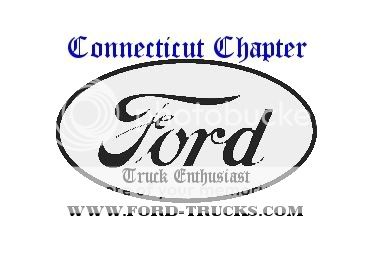
quote=Zookie400;7122253]i made this one using the logo ford used from 1912 - 1928
i tried to make it an oval shaped sticker, but i cant do it on the software i am using unless i start with another image and merge layers and BAH......SO just imagine this sticker as a white oval.
 [/quote]
quote=Zookie400;7122253]i made this one using the logo ford used from 1912 - 1928
i tried to make it an oval shaped sticker, but i cant do it on the software i am using unless i start with another image and merge layers and BAH......SO just imagine this sticker as a white oval.
[/quote]
