


NY Chapter Decal??
Postmaster
Joined: Mar 2008
Posts: 3,069
Likes: 1
From: LONG ISLAND N.Y.
neil,
whatever you want to do just let me know and if i can help then i will. personally i did'nt think anything i did was ready to be voted on. i'd like to help you make a really good quality image. light a fire under some asses and get some input on what members would like to see. thanks for your help. i got to go back to work. i'll check in later.
-ed
Post Fiend

Joined: Sep 2005
Posts: 9,653
Likes: 3
From: in the adirondack mts
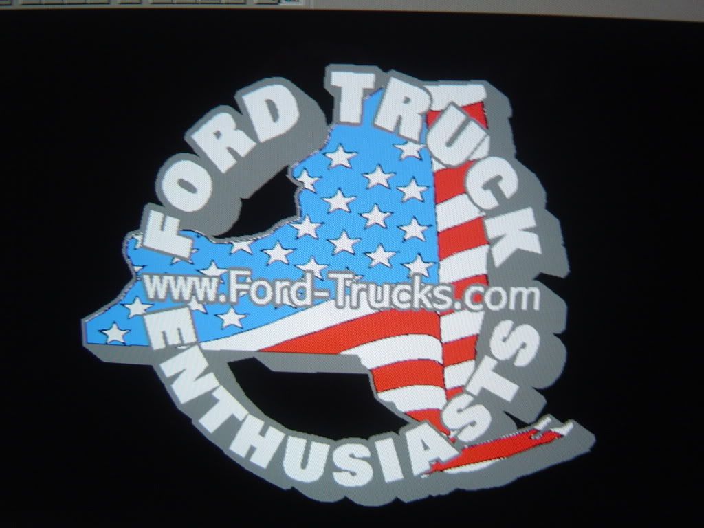
I've changed my mind again......I really am digging #7 but..BUT I'd kill to see it without the Light Blue "dimension" on the circling "Ford Truck Enthusiast(s).
By NO means a critical view of the design by me.....just a thought. Keep in mind I have NO art skills.
By NO means a critical view of the design by me.....just a thought. Keep in mind I have NO art skills.
FTE Leadership Emeritus
Joined: Jul 2002
Posts: 42,561
Likes: 423
From: Long Island USA

If #2 were a good-quality decal, I'd stick it right dead center in my SD's tailgate right where the Ford oval is on the '08-up SD's.
But the font for the "ford-trucks.com" doesn't look right in script.
But the font for the "ford-trucks.com" doesn't look right in script.
Thread Starter
|
Moderator & CL


Joined: Jul 2006
Posts: 109,789
Likes: 385
From: NY Finger Lakes Region
Please refer to the number of the image as noted in post #117 where all of the samples are posted together
Carl, I assume that you are refering to #3 in post #117.. correct ??
Here are my favorite ones at this point......
#3 with the speeling corrected for 'enthusiasts'
#7
#13 I like the font and style for FTE, but maybe something a little different for the remaining lettering to make it stand out also.... if possible
Postmaster
Joined: Mar 2008
Posts: 3,069
Likes: 1
From: LONG ISLAND N.Y.
would the lettering be seperate from the oval. if so gerber machines can print on clear vinyl very well. just like you see on almost all volunteer fire depts. it can get expensive, or you can do that with a printed oval to achive the shadowing and then add cut vinyl for the lettering. i can see putting that on my rear cap/cab window. it might be a little much for me on the tailgate 20" 's away from my factory emblem.
-ed
Postmaster
Joined: Mar 2008
Posts: 3,069
Likes: 1
From: LONG ISLAND N.Y.
i like this one also. i will remove the perspective shadow and repost it. keep the constructive critism coming. its the only way we'll hash out a cool sticker.
-ed
FTE Stories
Ford Trucks for Ford Truck Enthusiasts

3 Best / 3 Worst Parts of Modern Ford Ownership
Brett Foote
10 Amazing Upgrades That Solve Common Ford Truck Owner Headaches
Pouria Savadkouei
Every 2026 Ford Engine Explained
Brett Foote
10 Ugly Ford Trucks That We Still Kinda Love
Joe Kucinski
10 Things Every Truck Owner NEEDS (2026 Edition)
Michael S. Palmer
Rezvani's Latest Post-Apocalyptic Monster Is a Ford F-150 Raptor Underneath
Verdad Gallardo
Top 10 Most Expensive Ford Trucks Ever Sold on Bring a Trailer
Joe Kucinski
2027 Ford Super Duty Buyer's Guide (Every Model, Engine, & Package)
Brett Foote
Top 10 Ford Truck Tragedies
Joe KucinskiPostmaster
Joined: Mar 2008
Posts: 3,069
Likes: 1
From: LONG ISLAND N.Y.
Please refer to the number of the image as noted in post #117 where all of the samples are posted together
Carl, I assume that you are refering to #3 in post #117.. correct ??
Here are my favorite ones at this point......
#3 with the speeling corrected for 'enthusiasts'
#7
#13 I like the font and style for FTE, but maybe something a little different for the remaining lettering to make it stand out also.... if possible
Carl, I assume that you are refering to #3 in post #117.. correct ??
Here are my favorite ones at this point......
#3 with the speeling corrected for 'enthusiasts'
#7
#13 I like the font and style for FTE, but maybe something a little different for the remaining lettering to make it stand out also.... if possible
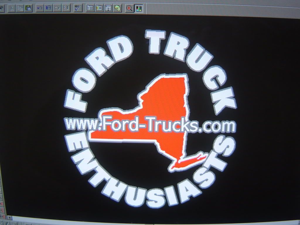
first off, glad to see i'm not the only one with a speeling problem.
 (look at #3). like i said before i like #3. i think it could be a nice window sticker.
#7 i don't care for.
#13 i will make some changes and post.(or really you will. thanks again)
-ed

Postmaster
Joined: Sep 2006
Posts: 3,048
Likes: 1
BTW im glad you like it.

Thread Starter
|
Moderator & CL
Joined: Jul 2006
Posts: 109,789
Likes: 385
From: NY Finger Lakes Region
Okay folks... here are some new samples and a couple of reworked ones for comments along with the original 14 that are posted together.
Thanks Ed
#15
#16
#17
#18
Thanks Ed
#15
#16
#17
#18
Thread Starter
|
Moderator & CL
Joined: Jul 2006
Posts: 109,789
Likes: 385
From: NY Finger Lakes Region
Ed, could you whip up one with the text for #18 to match the text on #16 ??