Need ideas for stickers & banner!!!


#62
 05-01-2010, 05:19 PM

#64
05-01-2010, 05:24 PM
That might be the only thing that jumps out for me...
#67
05-01-2010, 05:33 PM
#70
05-01-2010, 08:14 PM
Elder User
Join Date: Feb 2010
Location: Reading, PA
Posts: 546
Likes: 0
Received 0 Likes
on
0 Posts
#71
05-01-2010, 08:16 PM
#72
05-01-2010, 08:17 PM
Join Date: Jan 2006
Location: Hanover,PA
Posts: 4,130
Likes: 0
Received 0 Likes
on
0 Posts
#75
05-01-2010, 09:22 PM

Join Date: Aug 2006
Location: DELAWARE, The First State
Posts: 47,273
Received 157 Likes
on
93 Posts
OK, I have been following your design thread, now my 3 cents. 
I always feel the emphasis should be on the chapter and not FTE. So maybe the lettering for the Pennsylvania Chapter should be larger and the Ford Truck Enthusiasts should be smaller. You are fortunate because your state outline is huge compared to DE and you can fit the lettering/graphics within the outline.
Some times the KISS principal applies for the first time design.
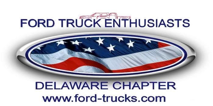
Example of the design Delaware uses:
NEW

OLD

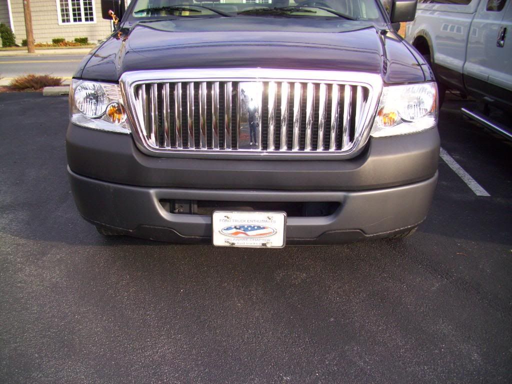
License Plate
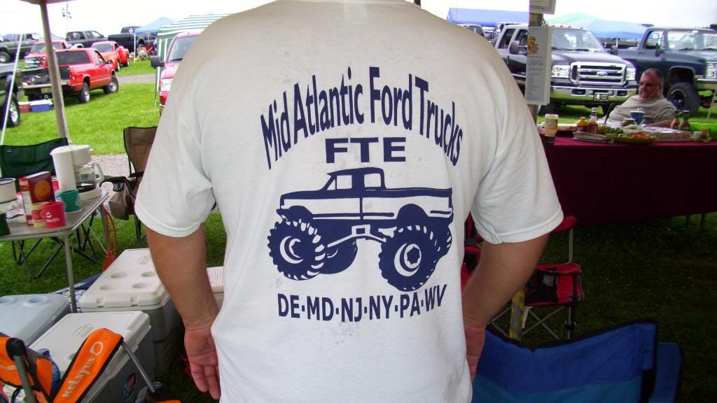
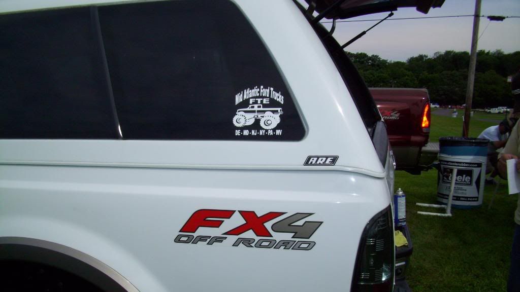
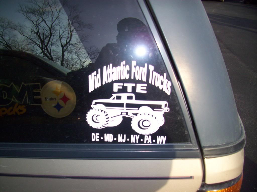
The decal for the MidAtlantic Ford Trucks:
Keep up the good work
I always feel the emphasis should be on the chapter and not FTE. So maybe the lettering for the Pennsylvania Chapter should be larger and the Ford Truck Enthusiasts should be smaller. You are fortunate because your state outline is huge compared to DE and you can fit the lettering/graphics within the outline.
Some times the KISS principal applies for the first time design.
Example of the design Delaware uses:
NEW
OLD
License Plate
The decal for the MidAtlantic Ford Trucks:
Keep up the good work