IT'S IDEAL!!!

View Poll Results: 
Use the woodgrained one


4
40.00%
Stick with the blue and gold


5
50.00%
Can't decide


1
10.00%
Voters: 10. You may not vote on this poll
Decision time
FTE Leadership Emeritus
Joined: Jul 2008
Posts: 111,873
Likes: 153
From: Wharton, NJ

I really like that one too...looks like a winner.
Thread Starter
|
Fleet Owner
Joined: Aug 2001
Posts: 29,941
Likes: 46
From: Drummonds, TN USA
It might be tricky, but there's not much of a curve in that line. FIreworks has a way to "WARP" images that can do all kinds of stuff.
They're ALL winners. And from now on I guess it will be a pet policy of mine to make those graphics using images from G2G's so that it promo's that too... It's extremely fitting that it worked out that way!!!
 to one and all!
Thread Starter
|
Fleet Owner
Joined: Aug 2001
Posts: 29,941
Likes: 46
From: Drummonds, TN USA
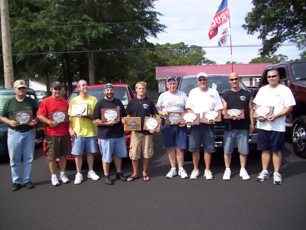
I WILL use this picture for round four. Anyone with a group shot like this from a G2G I can use at least six more just like that.... 
FTE Stories
Ford Trucks for Ford Truck Enthusiasts

3 Best / 3 Worst Parts of Modern Ford Ownership
Brett Foote
10 Amazing Upgrades That Solve Common Ford Truck Owner Headaches
Pouria Savadkouei
Every 2026 Ford Engine Explained
Brett Foote
10 Ugly Ford Trucks That We Still Kinda Love
Joe Kucinski
10 Things Every Truck Owner NEEDS (2026 Edition)
Michael S. Palmer
Rezvani's Latest Post-Apocalyptic Monster Is a Ford F-150 Raptor Underneath
Verdad Gallardo
Top 10 Most Expensive Ford Trucks Ever Sold on Bring a Trailer
Joe Kucinski
2027 Ford Super Duty Buyer's Guide (Every Model, Engine, & Package)
Brett Foote
Top 10 Ford Truck Tragedies
Joe Kucinski


Thread Starter
|
Fleet Owner
Joined: Aug 2001
Posts: 29,941
Likes: 46
From: Drummonds, TN USA
Hah! I thought it was pretty cool that there was a third ford emblem in that one shot sort of hidden in the middle...
I think I'm sold on the lettering too, it's down pat and works well with all backgrounds.
Any news on the trophy shop yet? How deep is the bite if we want to go gold, silver, and bronze (even if they're really gold tone, chrome, and brass) ?
I think I'm sold on the lettering too, it's down pat and works well with all backgrounds.
Any news on the trophy shop yet? How deep is the bite if we want to go gold, silver, and bronze (even if they're really gold tone, chrome, and brass) ?