Thinking about getting this done
#1
 10-30-2012, 12:11 AM

Thinking about getting this done
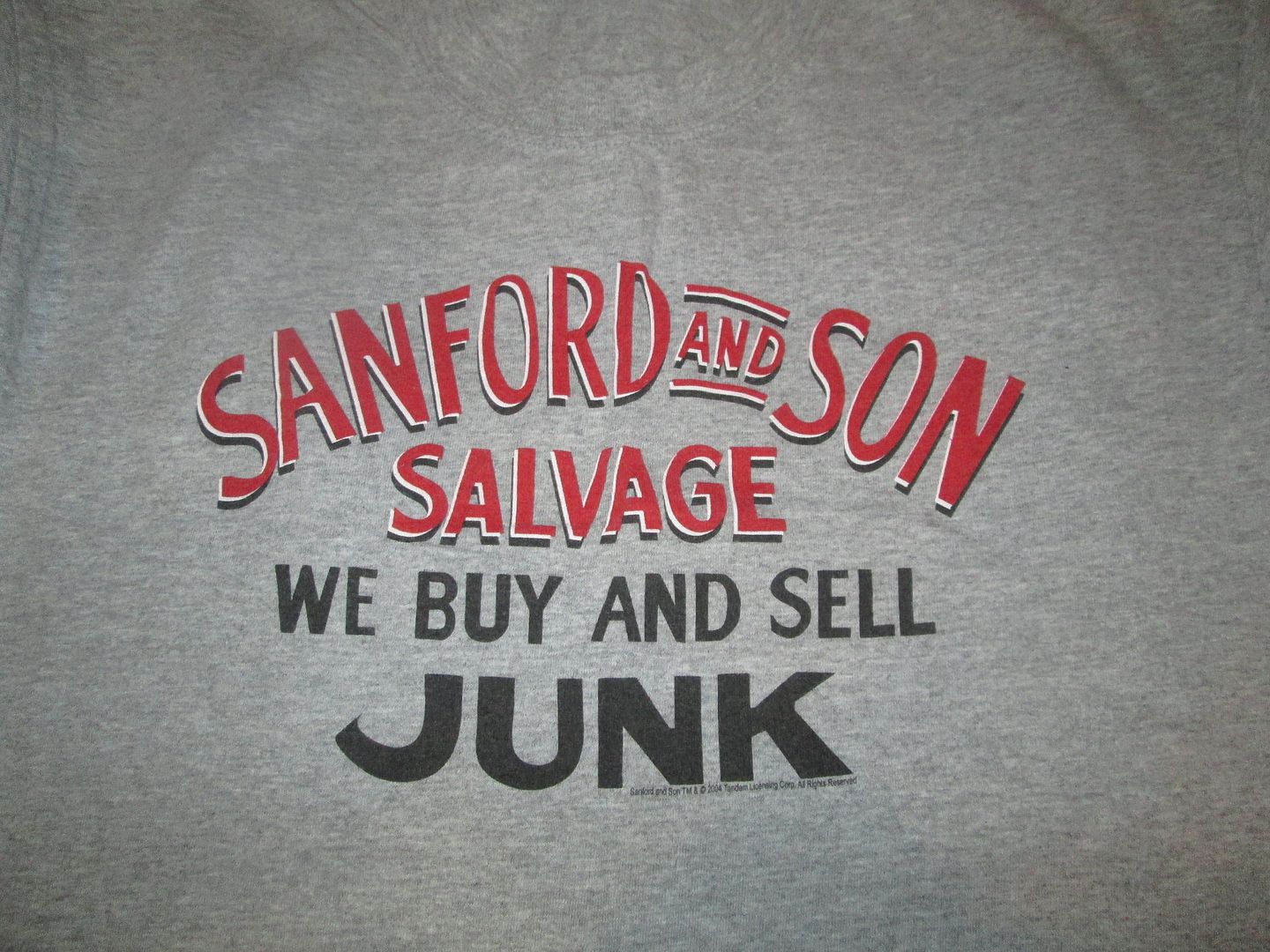
This is the inspiration.


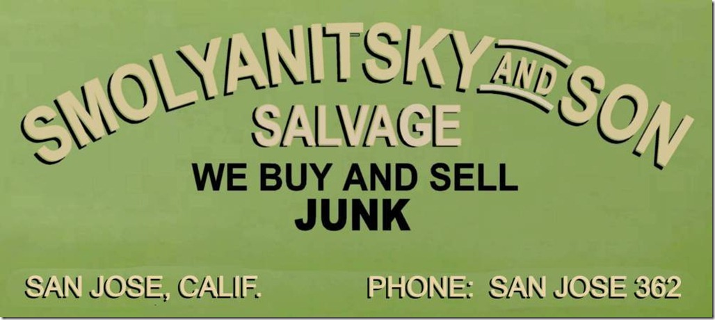
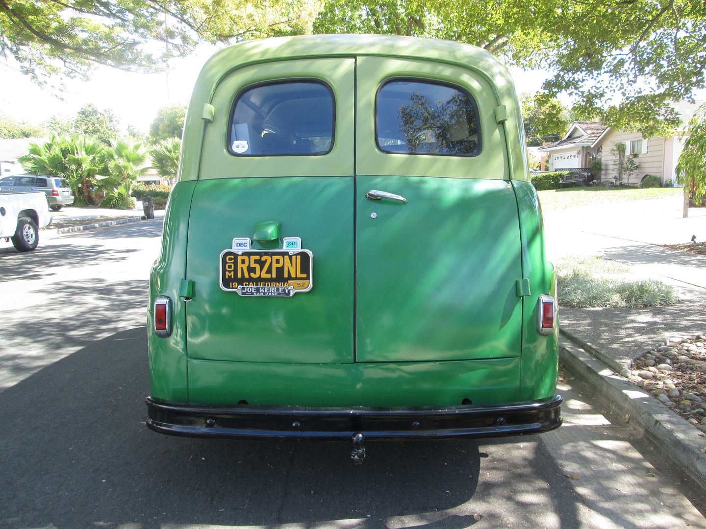
This is the proposed execution. It's obviously a play on words. Yes, that is my last name and it is that long. I also have a son. My wife has now taught him to say that I buy junk and bring it home, because I go to a lot of swap meets, estate sales and auctions. Of course, this is said with a smile on her face. Plus, I want to start taking the truck around to the local swap meets, sales and auctions. So the sign is very fitting.

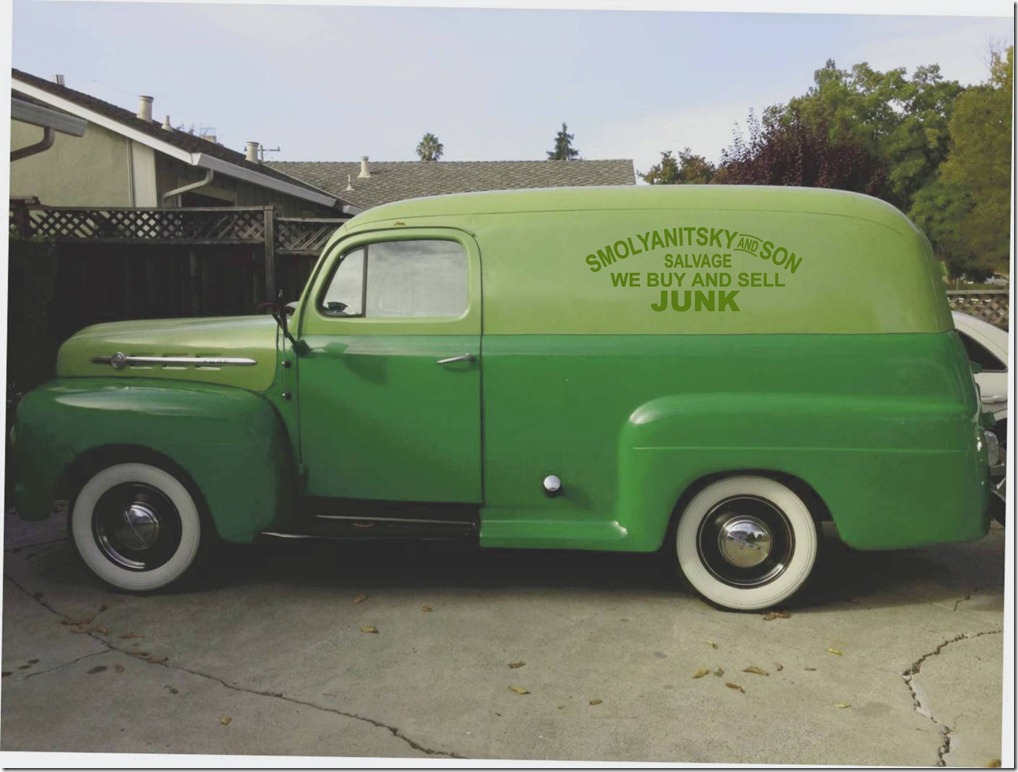
Also had a choice of these.
Would have a black shadow outline behind the letters.
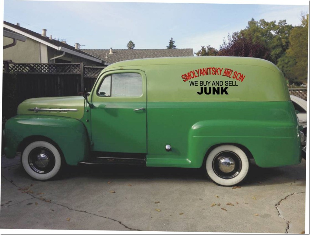
This would have a white or black outline behind the letters. Although I like the color scheme, it would look like Christmas colors all the time.
Not sure if I would have her paint anything on the rear door. I think that it may be too much. Although, I did just think of this writing for the back door: "Honk for Junk".
The design would be hand-painted by a very nice and talented painter and pinstriper lady that I know. She's only charging me half of her regular rate to do both sides. Personalized signage like this may devalue the truck if I were ever to re-sell it, but I don't have any plans on selling it anytime soon. Plus, the sign could be painted over by the new owner if I ever do sell the truck.
What do you think?
This is the proposed execution. It's obviously a play on words. Yes, that is my last name and it is that long. I also have a son. My wife has now taught him to say that I buy junk and bring it home, because I go to a lot of swap meets, estate sales and auctions. Of course, this is said with a smile on her face. Plus, I want to start taking the truck around to the local swap meets, sales and auctions. So the sign is very fitting.
Also had a choice of these.
Would have a black shadow outline behind the letters.
This would have a white or black outline behind the letters. Although I like the color scheme, it would look like Christmas colors all the time.
Not sure if I would have her paint anything on the rear door. I think that it may be too much. Although, I did just think of this writing for the back door: "Honk for Junk".
The design would be hand-painted by a very nice and talented painter and pinstriper lady that I know. She's only charging me half of her regular rate to do both sides. Personalized signage like this may devalue the truck if I were ever to re-sell it, but I don't have any plans on selling it anytime soon. Plus, the sign could be painted over by the new owner if I ever do sell the truck.
What do you think?
#2
10-30-2012, 12:26 AM
I like the first one best. The greenish-cream letters just seem to fit the look of the truck best, imho. The green clashed and blended in, and the red was to much, again jmho.
One Shot lettering enamel, which is likely what she'll use as it's the standard of the industry, will come off with a high speed buffer if you ever were to sell the truck. No worries about value there.
One Shot lettering enamel, which is likely what she'll use as it's the standard of the industry, will come off with a high speed buffer if you ever were to sell the truck. No worries about value there.
#3
10-30-2012, 12:41 AM
Laughing Gas
Awesome idea, go for it. I agree the first color scheme is best, BUT try a dark red or reddish-brown for the drop shadows and lower lettering instead of black. It will contrast well with the green and look a little more retro in my opinion. This is a little crude but you get the idea:

That said, I do like how the font emphasizes "JUNK" in the second example!
That said, I do like how the font emphasizes "JUNK" in the second example!
#4
10-30-2012, 12:45 AM
Mike,
I like the color change that you made. The reddish-brown does make it look more retro. However, because of the truck being green, I want to try and stay away from anything red related. Also, the paint scheme on the truck is green and black. The running boards, mirrors, and wheels are black, along with a black stripe around the truck separating the two-tone colors.
I'll propose the change to the artist to see what she thinks. She's done this more than me.


#7
10-30-2012, 12:53 AM
Laughing Gas
Mike,
I like the color change that you made. The reddish-brown does make it look more retro. However, because of the truck being green, I want to try and stay away from anything red related. Also, the paint scheme on the truck is green and black. The running boards, mirrors, and wheels are black, along with a black stripe around the truck separating the two-tone colors.
I'll propose the change to the artist to see what she thinks. She's done this more than me.
I like the color change that you made. The reddish-brown does make it look more retro. However, because of the truck being green, I want to try and stay away from anything red related. Also, the paint scheme on the truck is green and black. The running boards, mirrors, and wheels are black, along with a black stripe around the truck separating the two-tone colors.
I'll propose the change to the artist to see what she thinks. She's done this more than me.
Trending Topics
#8
10-30-2012, 12:53 AM

#9
10-30-2012, 12:55 AM
You do have a valid point regarding the contrasting color being brown-ish. I just don't want to introduce too many colors and make the truck look like a rainbow.
#11
10-30-2012, 01:21 AM
Laughing Gas
I think you're right to be conservative in your use of color. As long as you stick to low contrast, subdued color combos (e.g., cream & brown versus red & green or black & white) I think you'll be safe. While I feel that black is a good trim color for individual components (bumpers, wheels, etc.), it is too high contrast for the lettering. But that's just my taste.
#12
10-30-2012, 01:28 AM
#14
10-30-2012, 07:24 AM
That looks pretty nice, Ilya. Agreed that the cream color looks most appropriate, but the red I letters are more easily read from a distance.
I was intending to make a dump run this weekend, but since you are in a buying mood, I can cut you a deal on some first-rate junk. I'll even dump it right in your driveway, sometime well after midnight.LOL!
I was intending to make a dump run this weekend, but since you are in a buying mood, I can cut you a deal on some first-rate junk. I'll even dump it right in your driveway, sometime well after midnight.LOL!
#15
10-30-2012, 07:52 AM